What is a Statistical Infographic template?
Are you looking to present your data in a more impactful way? Statistical charts are the perfect solution for you! Not only do these charts provide a visually appealing way to display your data, but they can also provide valuable insight into trends, correlations, and other patterns in the data.
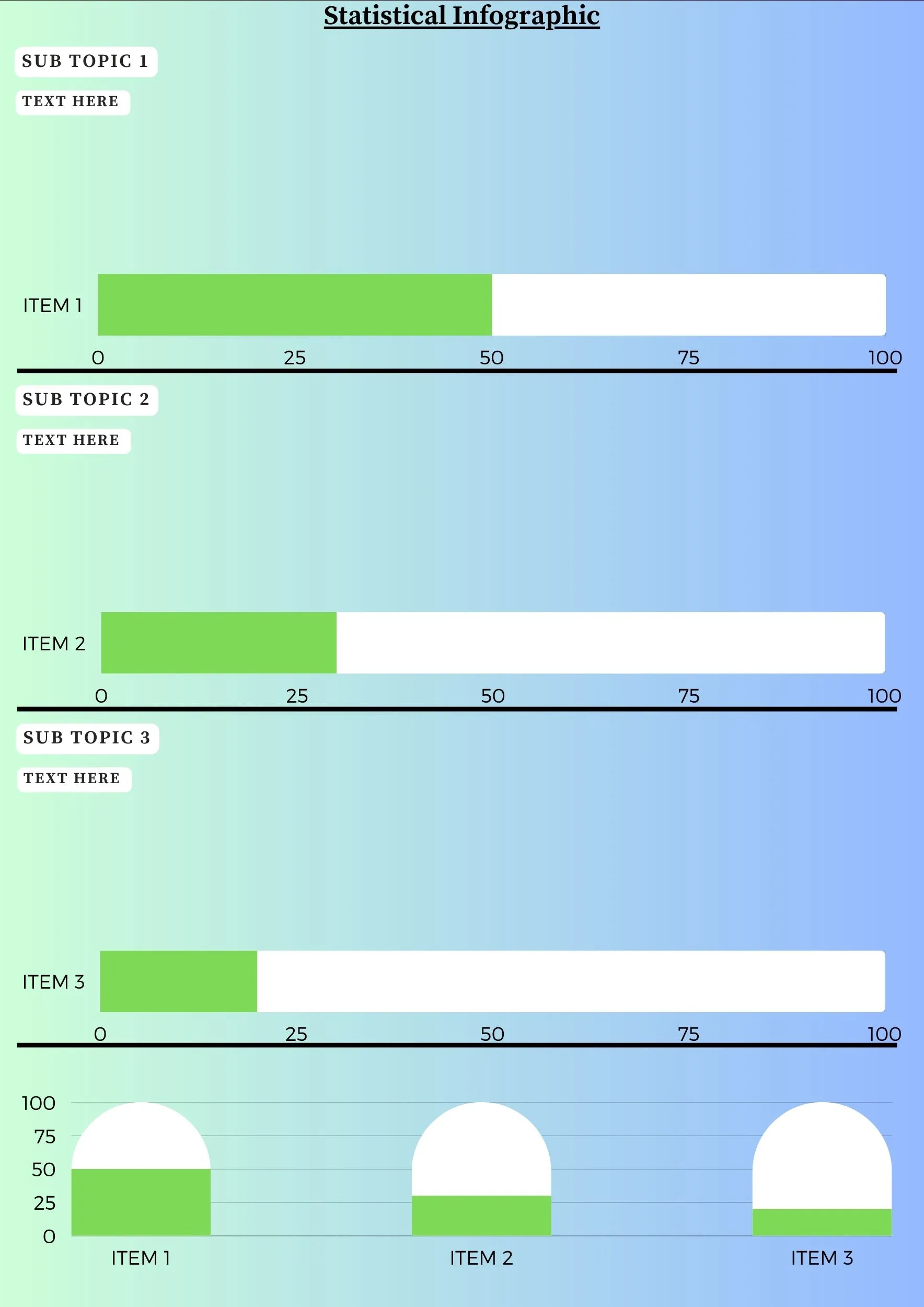
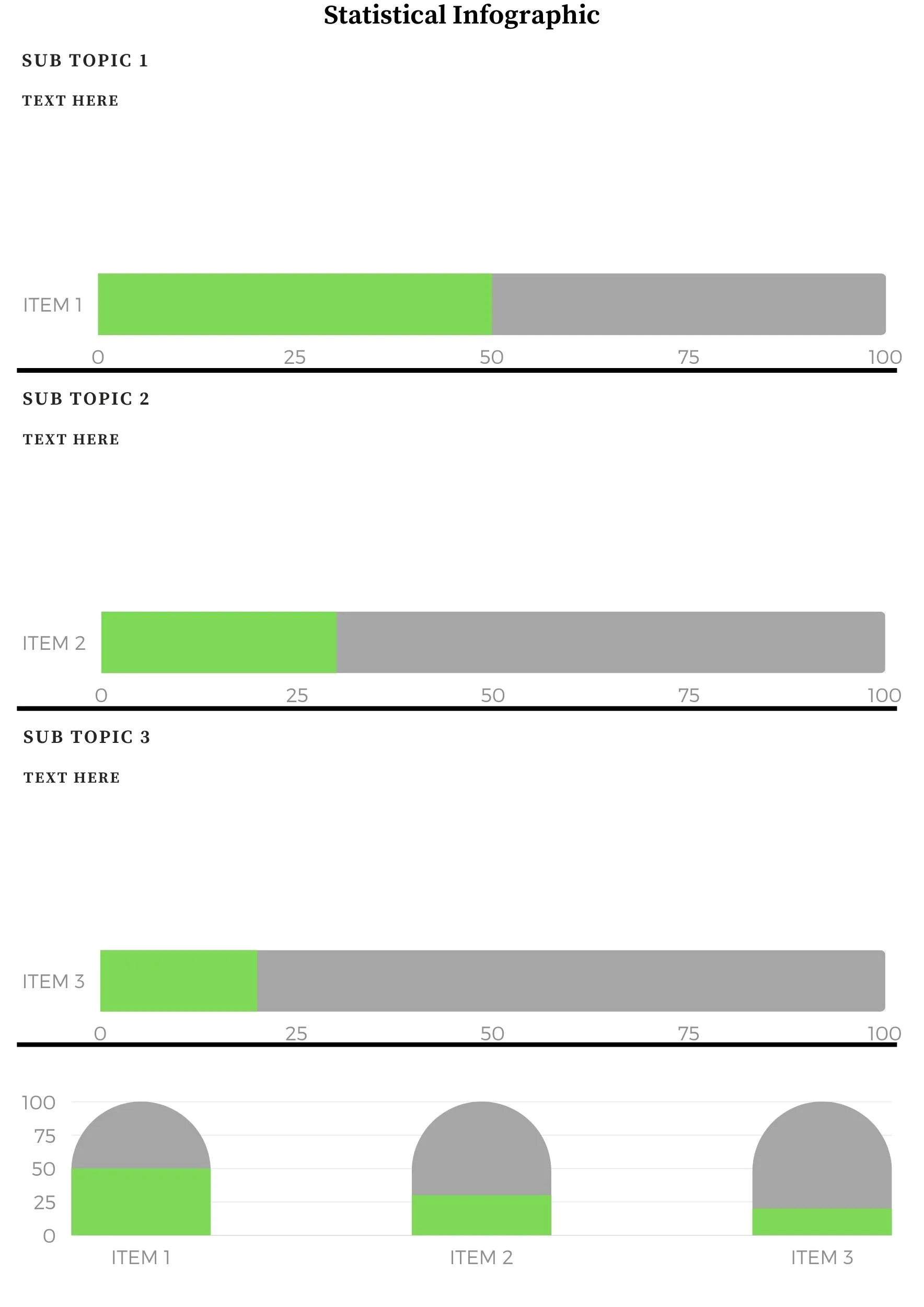
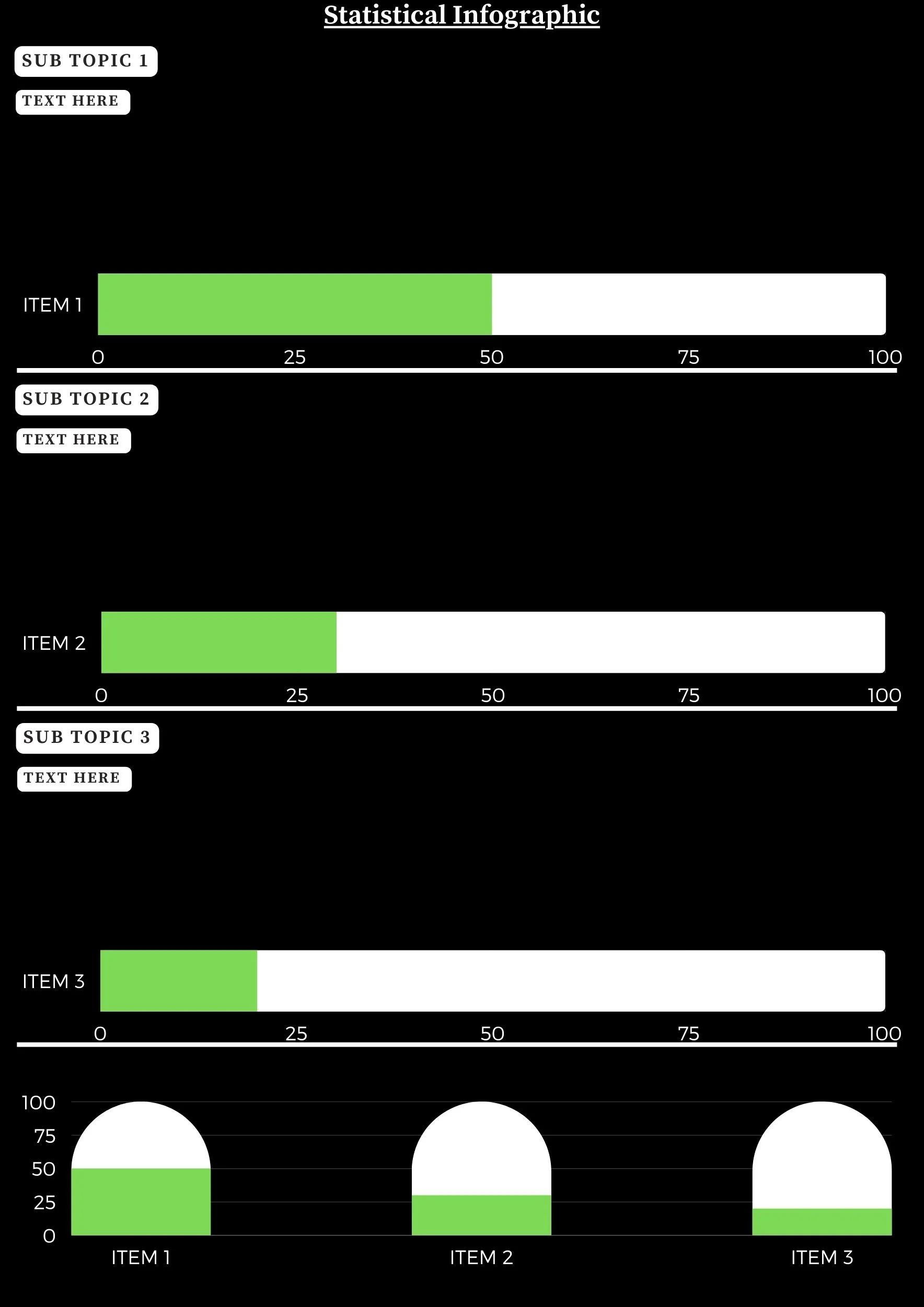
Statistical Infographic, also referred to as combo charts, are versatile and can be used to present data points in different formats. For example, you can show two different data sets side by side on the same chart, or you can combine different types of charts (such as a bar chart and a line chart) to show multiple data points in a single chart.
When creating a Statistical / Mixed chart, there are a few key considerations to keep in mind. First, you should ensure that all the data points are relevant to one another. Second, you should strive for clarity when presenting the data. Third, the chart should be easily understood by all viewers.
One of the benefits of using Statistical / Mixed charts is that they allow you to quickly and clearly compare different data points. For example, a combo chart can easily compare sales figures from different quarters. A combo chart can also be used to compare different types of data such as sales figures and customer satisfaction ratings.
Another benefit of Statistical / Mixed charts is that they can be used to identify patterns in the data. For example, a combo chart can be used to identify a trend in sales figures over time. It can also be used to identify correlations between different data points, such as the correlation between customer satisfaction ratings and sales figures.
Finally, Statistical / Mixed charts are a great way to communicate the data in an engaging and visually appealing way. They can help to make a data-heavy presentation more engaging and understandable for the audience.
So, When creating a Statistical charts, there are a few key considerations to keep in mind. First, you should ensure that all the data points are relevant to one another. Second, you should strive for clarity when presenting the data. Third, the chart should be easily understood by all viewers.
Thus, Statistical are a great way to present data in a visually appealing and effective way. They can help to quickly and clearly compare different data points and identify patterns in the data. They are also a great way to communicate the data in an engaging and understandable way.
Overall, a statistical infographic template is a powerful tool for presenting complex data in a clear and concise manner. Whether you are trying to communicate complex statistics to a wide audience or simply want to better understand your own data, a statistical/mixed chart infographic template can help you achieve your goals.
More Related Topics:
Sign up to get free tips and templates.